Design Experience
When it came to design, I was responsible for using my expertise and creative eye to spot changes that I felt needed to be made and to present them to user groups for feedback on if said change should be made.
My Role
Wording Design
From our first prototyping tests and our presentation of the web page to future users of the site, we learned that there were many issues. Subsequently, major changes were made. Our first change to make was the choice of certain wording on the page. Our users did not understand what the website meant by “Yours” as you can see in image 1. The reason that we used the word “Yours” on the side menu was because we wanted to use the tab on the menu to present the news feed from your own personal network.
After we got our user feedback, we presented options to a user group and they thought that “All” was the best option as you can see in image 2. “All” will be used to present all of the news feed on the site and then the other options will be used to filter certain types of posts.

image 1: original webpage from the invision prototype

image 2: the updated invision prototype
Creating a Post
One of the most important features on the website is the ability to create a post. This key feature is how the users generate content for the site. We wanted to ensure that the user's experience when creating a post is what they expect, clean looking, easy to navigate, and has all the features they need. After presenting our Invision prototype, as you can see on image 3, we learned that our users had the following concerns:
unsure where to click to begin typing
wanted a way to categorize their posts
After learning what our users wanted, we made several major design changes as you can see on image 4. To ensure our users knew how to navigate creating a post, we added some features to help the design look more like the standard post creation format. Some changes we made were adding a photo or icon on the top left corner, as many content driven sites have their post creation designs have this feature.
We needed a way for our posts to be categorized. If you see on the bottom left of the updated "create a post" box in image 4, you have the ability to select the category you feel your post fits best. We have these categories to ensure consistency of content on the site. If a user did not feel that the category they chose represents their whole post, they can add tags to the right of the category selection box. There are specific instructions on how to add tags to ensure no one is confused on how to use them. This feature was highly requested by our users.
The final major change we made on the design was something that we knew was going to change the whole feel of the post creation process. We added a visible “post” button to ensure that people knew this box’s purpose was to create a post.
After presenting the newly designed post box on image 4, about 80% of our users approved our design and understood exactly how to use it. For the other 20%, we continued to get their feedback and plan to make changes in the near future.
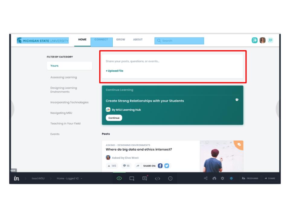
image 3: first edit of the post creation design

image 4: after feedback, post creation changed design