

Overview
The MSU Tech store is the Michigan State University Technology retailer located on campus and online for technology purchases, repairs, and consultations.
Title: User Experience Consultant
Tools: Google sheets, slides, docs, survey, a pencil, a sharpie marker and paper
Time Frame: 4 months
Responsibilities: To challenge the current MSU Tech Store in-store and online user experience to increase traffic and complete purchases. They wanted to achieve the ultimate “spartan experience,” so we had to uncover what that meant to their customers.

Research Goal:
Our goal was to identify the users opinions of the website:
Aesthetics
Navigation
Page Organization
As well as find out where we would integrate the Michigan State community to increase traffic.
Research: Interviews and “Quick and Dirty Usability Test”
To understand users opinions of the website
Interviews
We interviewed to better understand our users and their opinions on the current state of the MSU Tech Store Website.
Example Questions:
Where did you purchase your computer and why?
What do you know about the MSU Tech store?
Are you more likely to purchase technology on a website or in a store and why?
Do you have a favorite technology company, who is it, and why do you like/trust them?
What do you trust about a tech store on campus?
Do you find yourself clicking on ads on social media, why do you trust or not trust them?
We conducted 6 20 question interviews with currently enrolled MSU students. Our goal was to find out their technology history and knowledge, their knowledge of the MSU Tech Store, and their trust levels with advertisements that redirect them to possibly unknown websites.
“Quick and Dirty Usability Test”
As described in Leah Buley’s book “User Experience Team of One,” Quick and Dirty Usability Tests are used to see if the product is being used as intended.
Users: 4 Currently enrolled MSU Students
First mission: Users navigated the MSU Tech Store website and talked aloud as they made decisions on each webpage.
Second mission: Find the following on the website:
13’’ Space Gray Macbook Pro with Touch Bar
Techsmith Snagit 2018 Software
Our goal is to have the users talk through their choices of where they click and their frustrations and realizations and help us to inform our future design recommendations.

Research Findings:
These were the top cons that our users listed. We used these to produce the follow possible solutions to help the MSU Tech Store achieve the ultimate “Spartan Experience.”
Interview Feedback
Didn’t know the location of the store
Didn’t know about the free tech support that the store offers
Didn’t know that you could have a lender computer while your is getting fixed
Assumed that the products would be more expensive than a competitors
Likely wouldn’t buy small tech items such as a speaker
Usability Tests


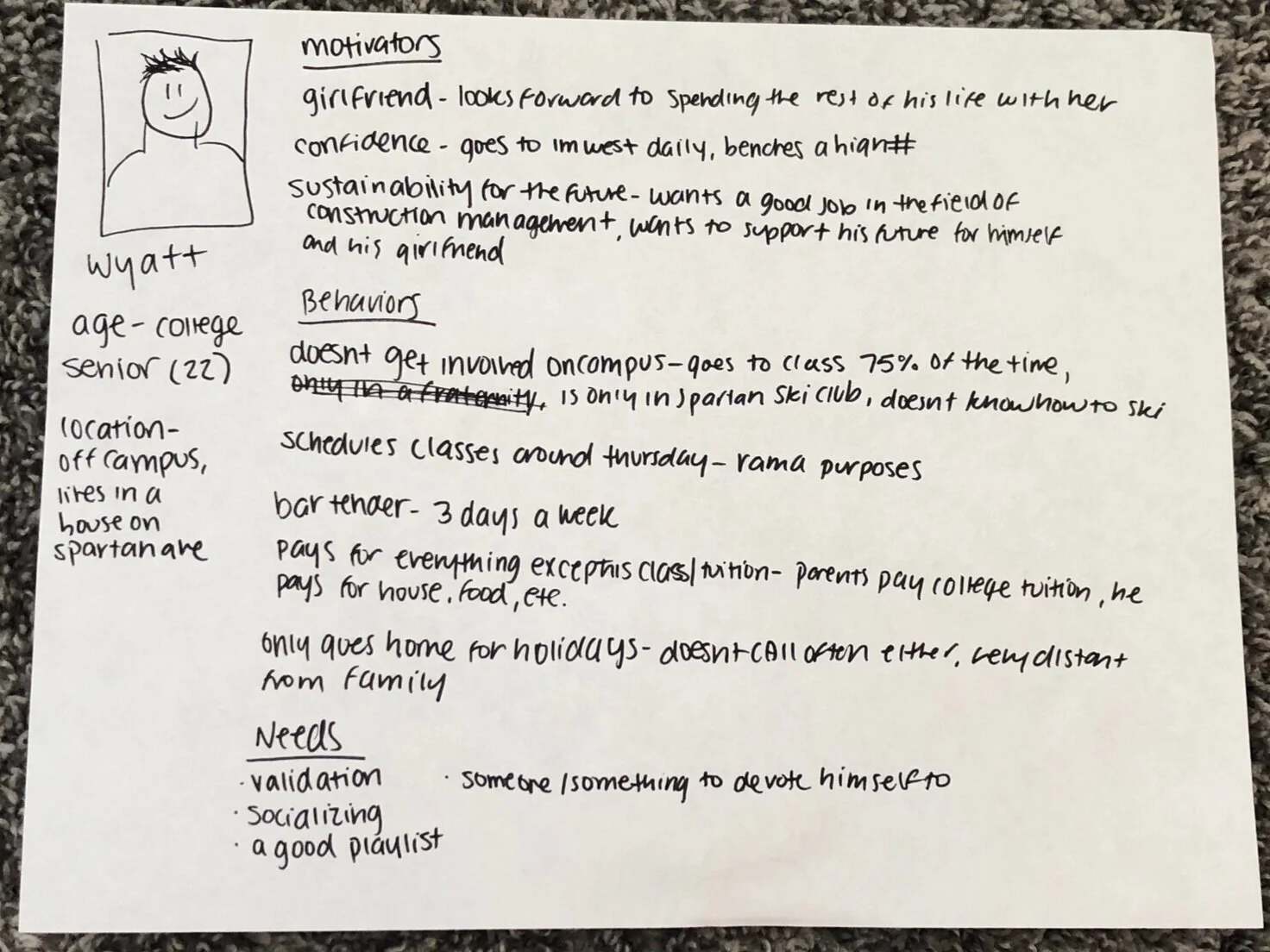
Output: Personas


Research: Competitor Analysis, Google Analytics, Heuristic Evaluation
Using users opinions and our knowledge on UI to improve the website
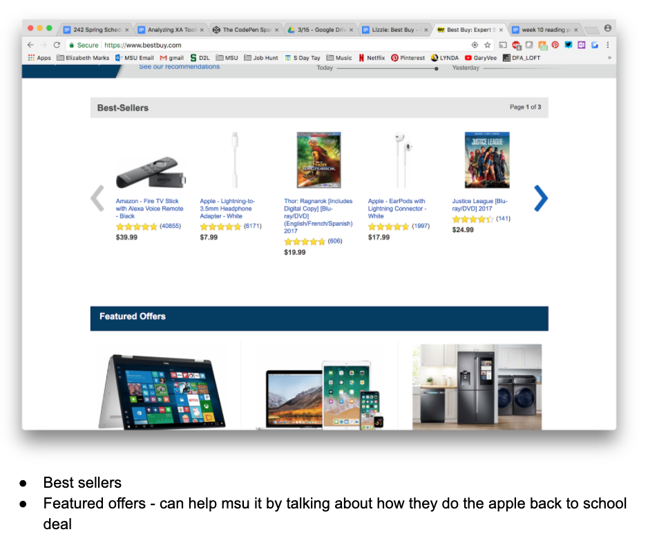
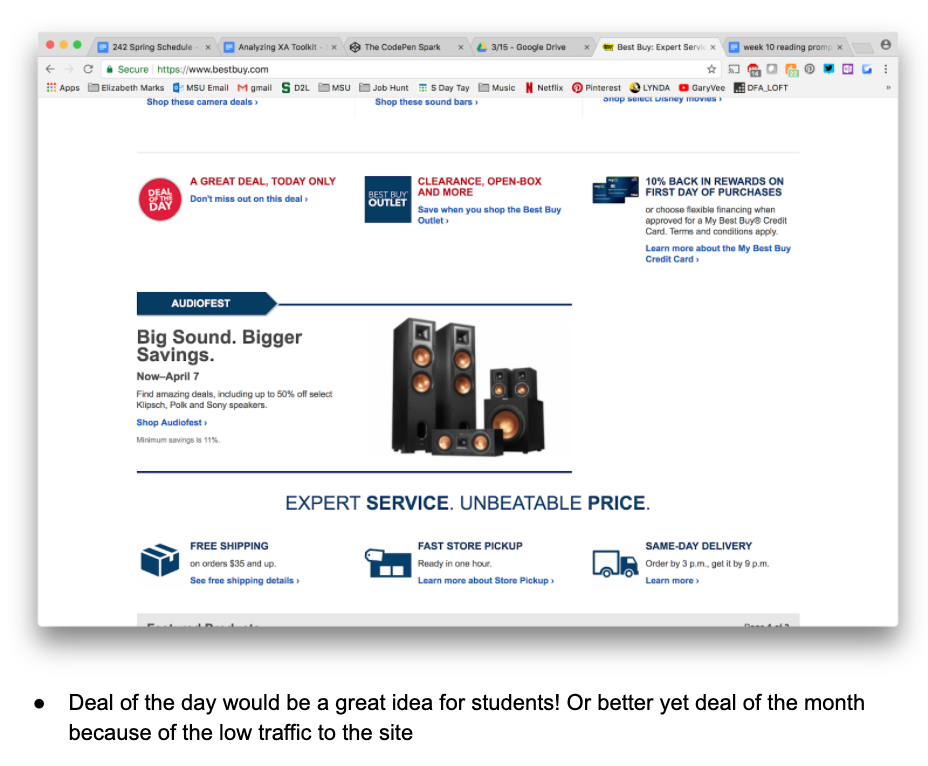
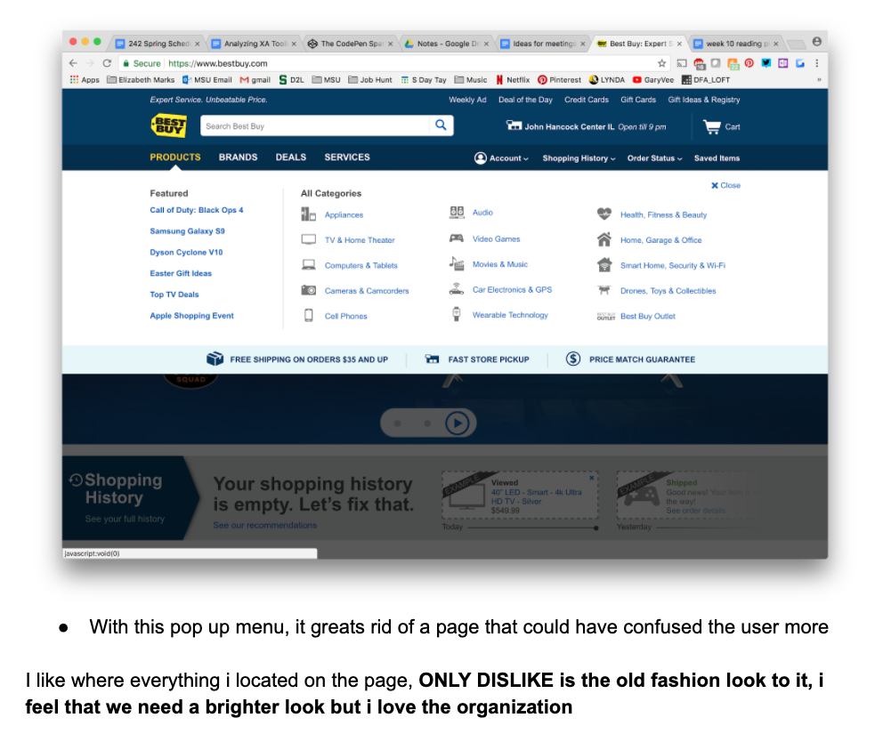
Competitor Analysis
We analyzed how the MSU Tech Stores competitors design their webpage.
Going through the Best Buy website, we went through and wrote down what we thought was positives (pros) and negatives (cons) of the following aspects:
Aesthetics
Navigation
Page Organization
We chose these because they were our biggest concern for the current MSU Tech Store website.
Google Analytics
Using the backend Google Analytics, we were able to identify the biggest drop off areas of the website. These drop off areas we identified were:
Checkout
Product Tabs such as “Computer and Tablets”
Home page
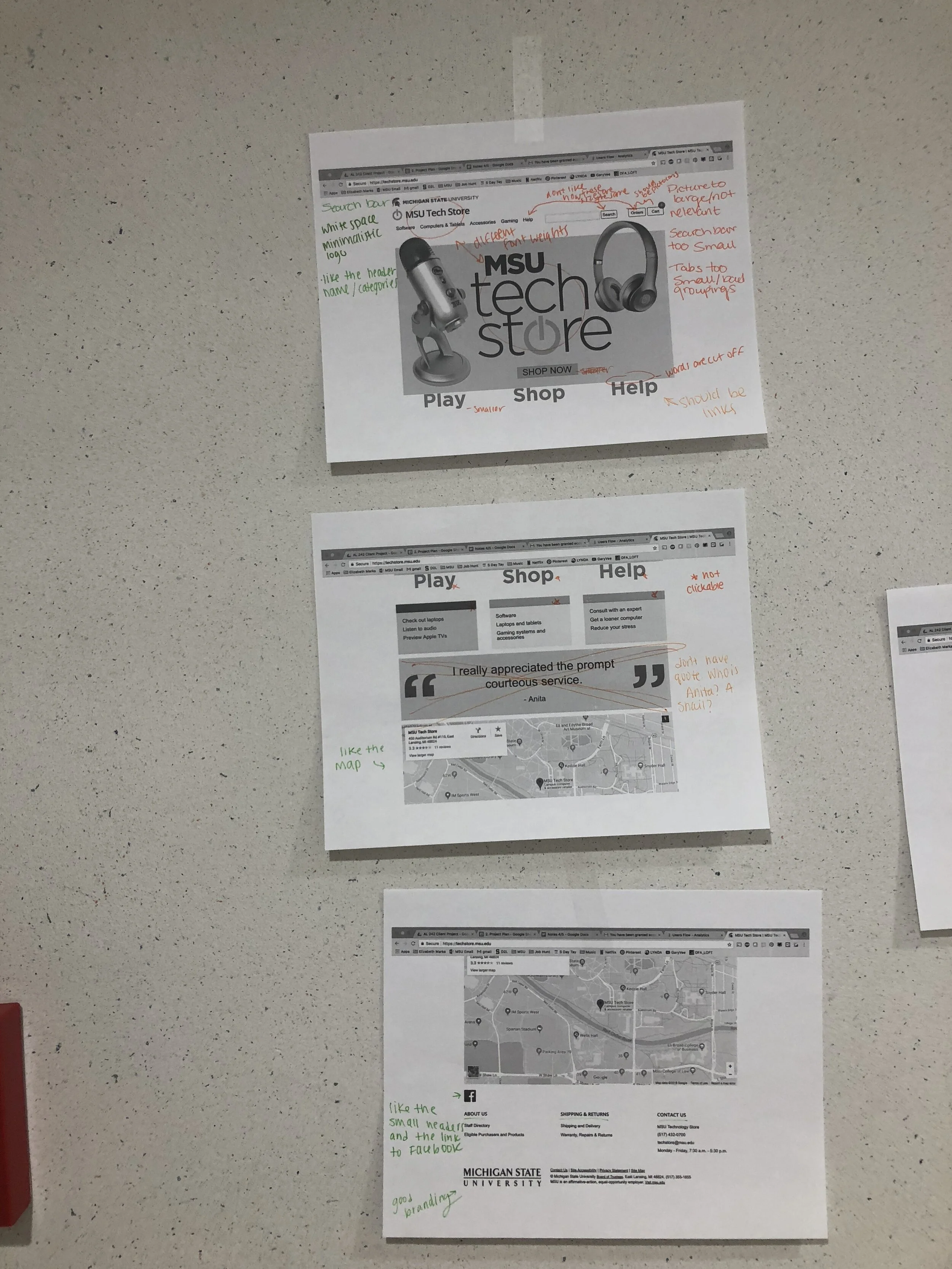
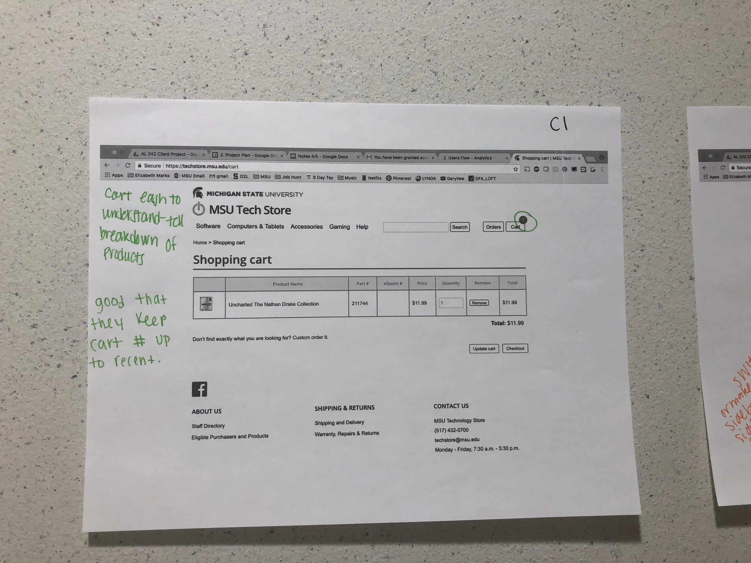
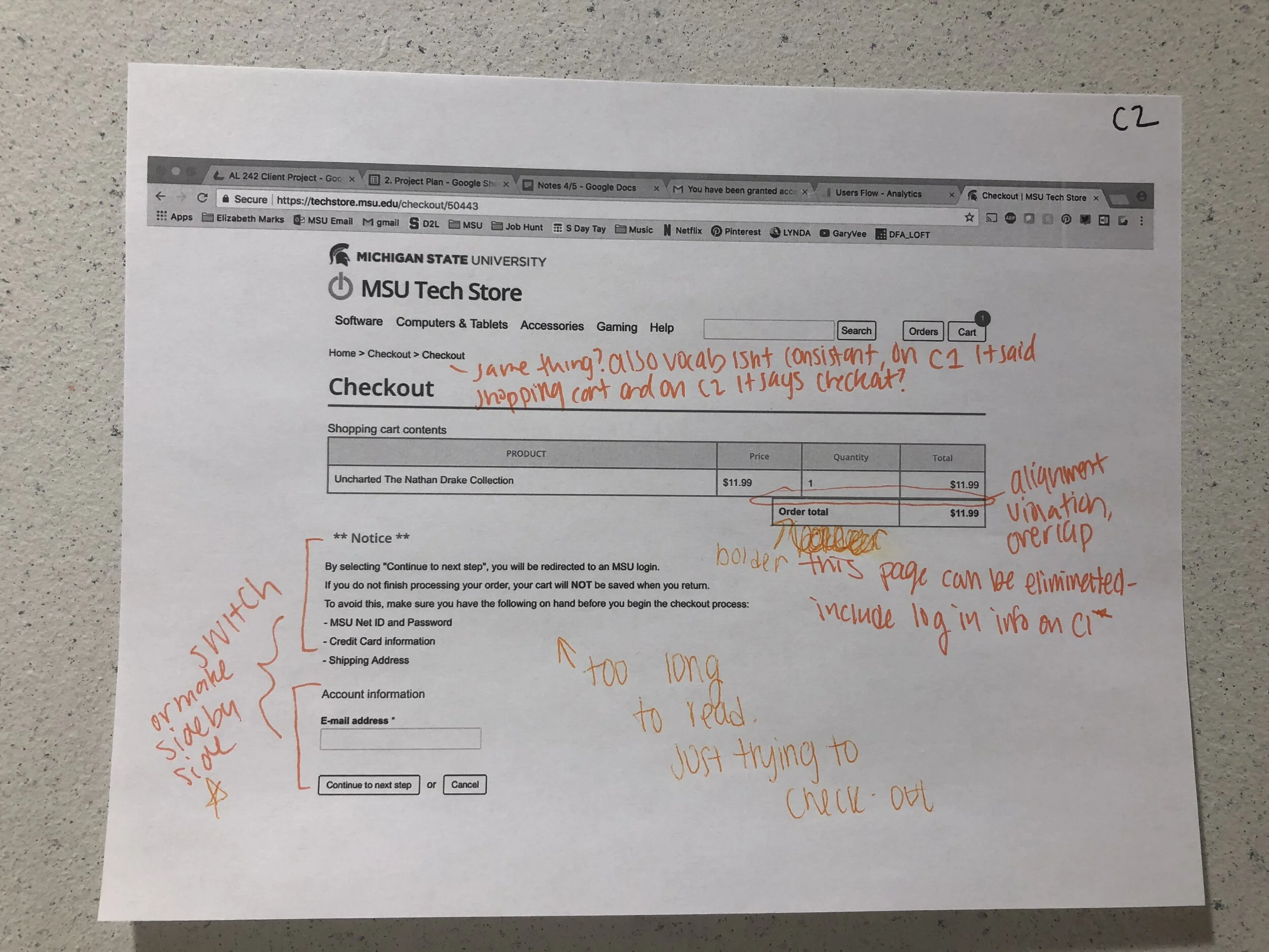
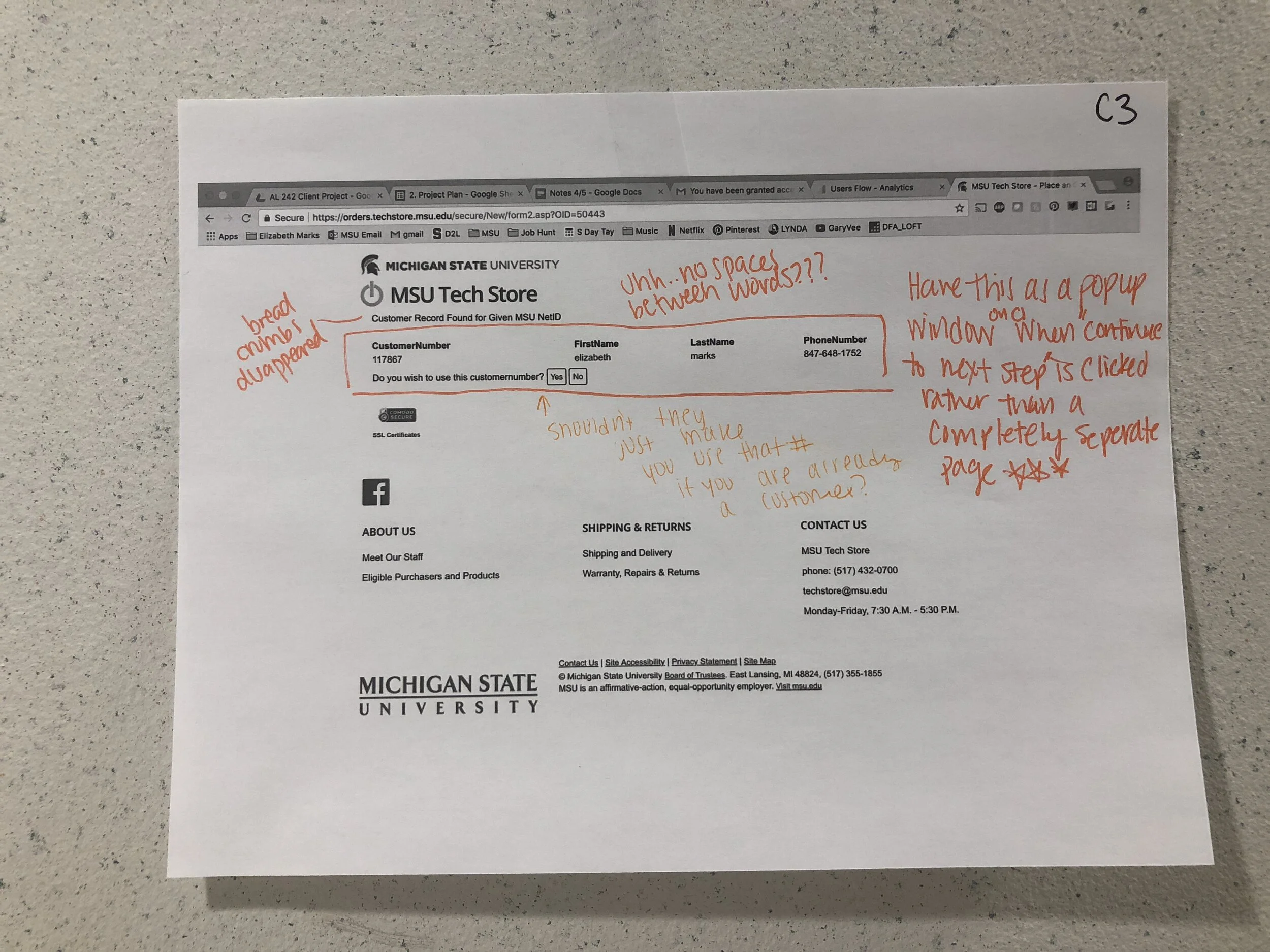
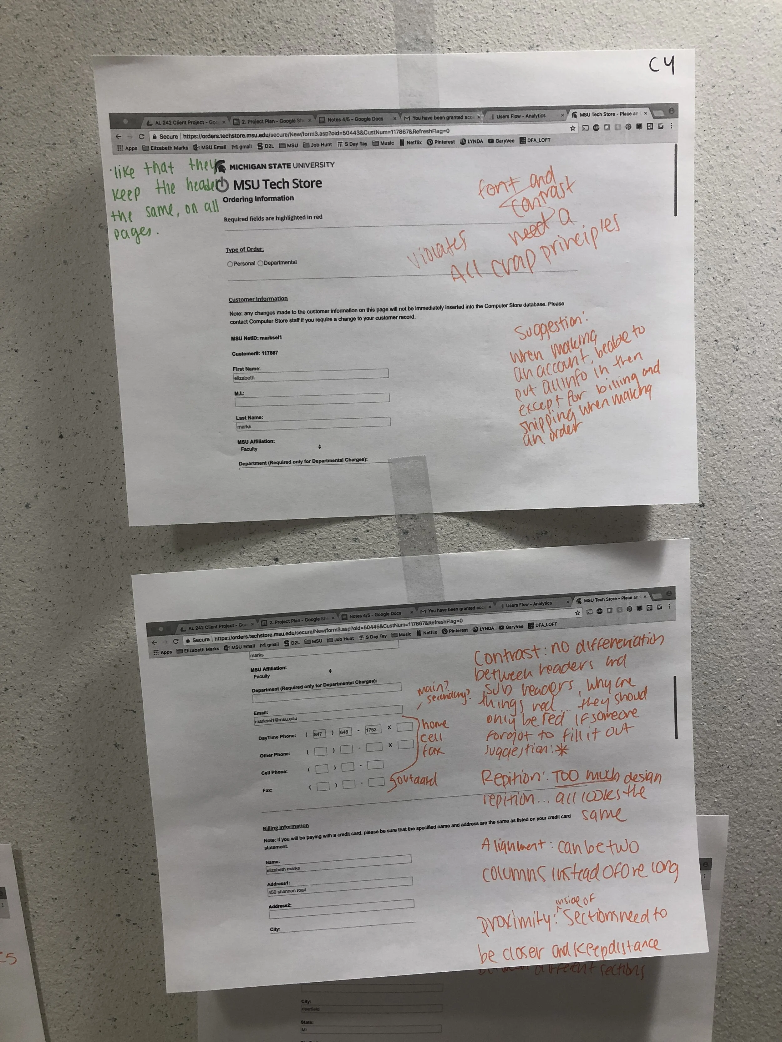
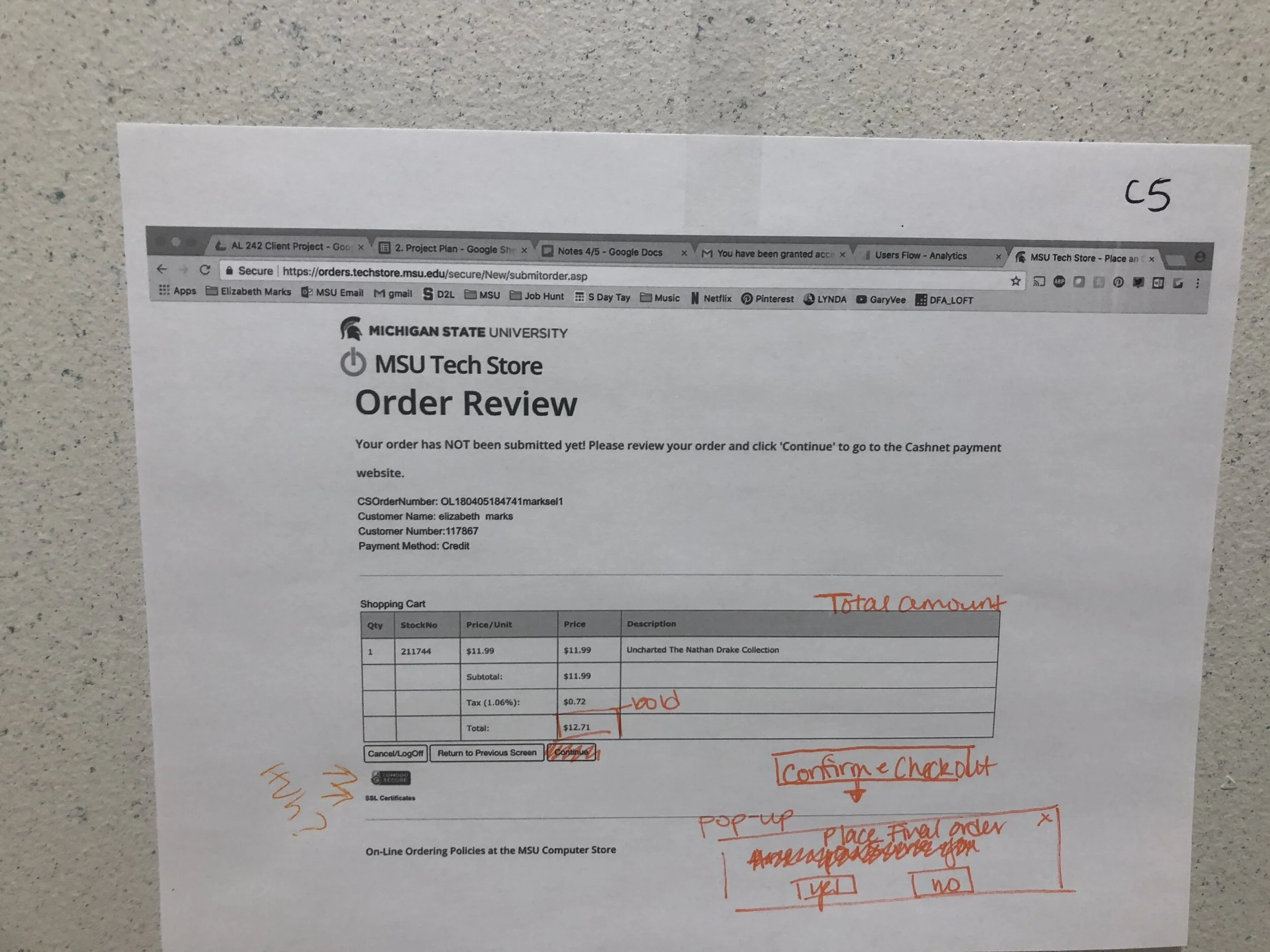
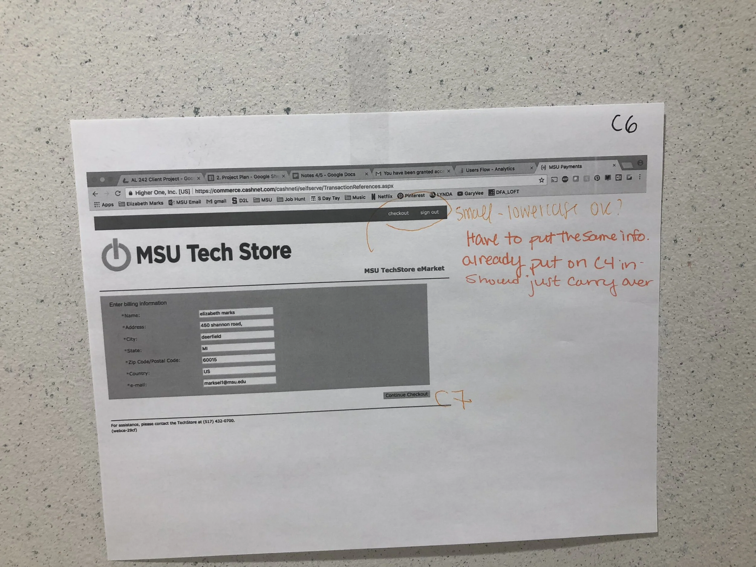
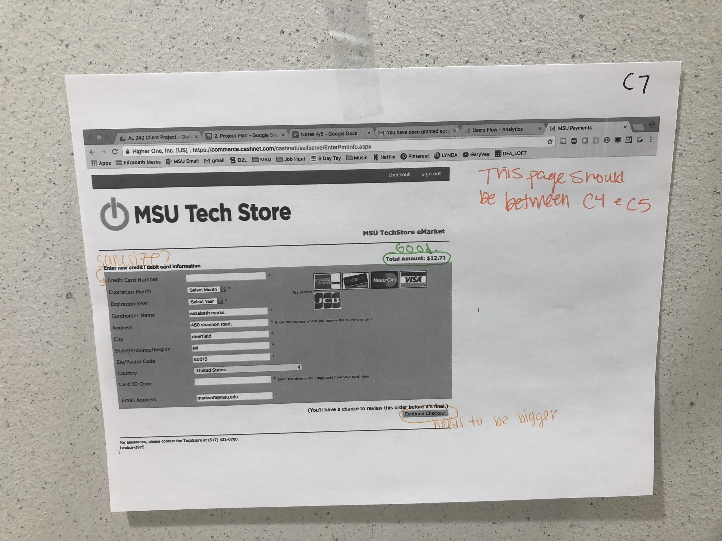
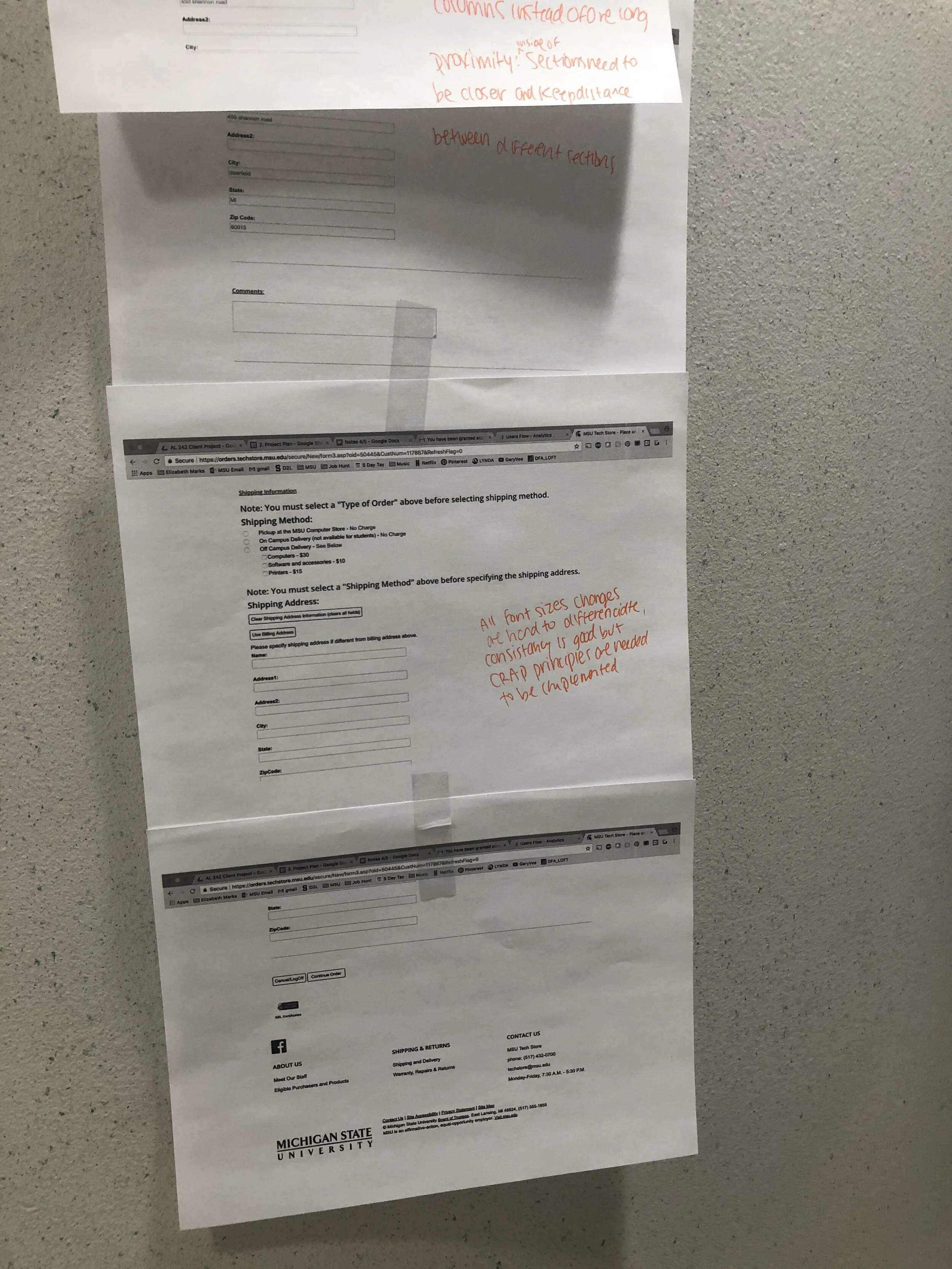
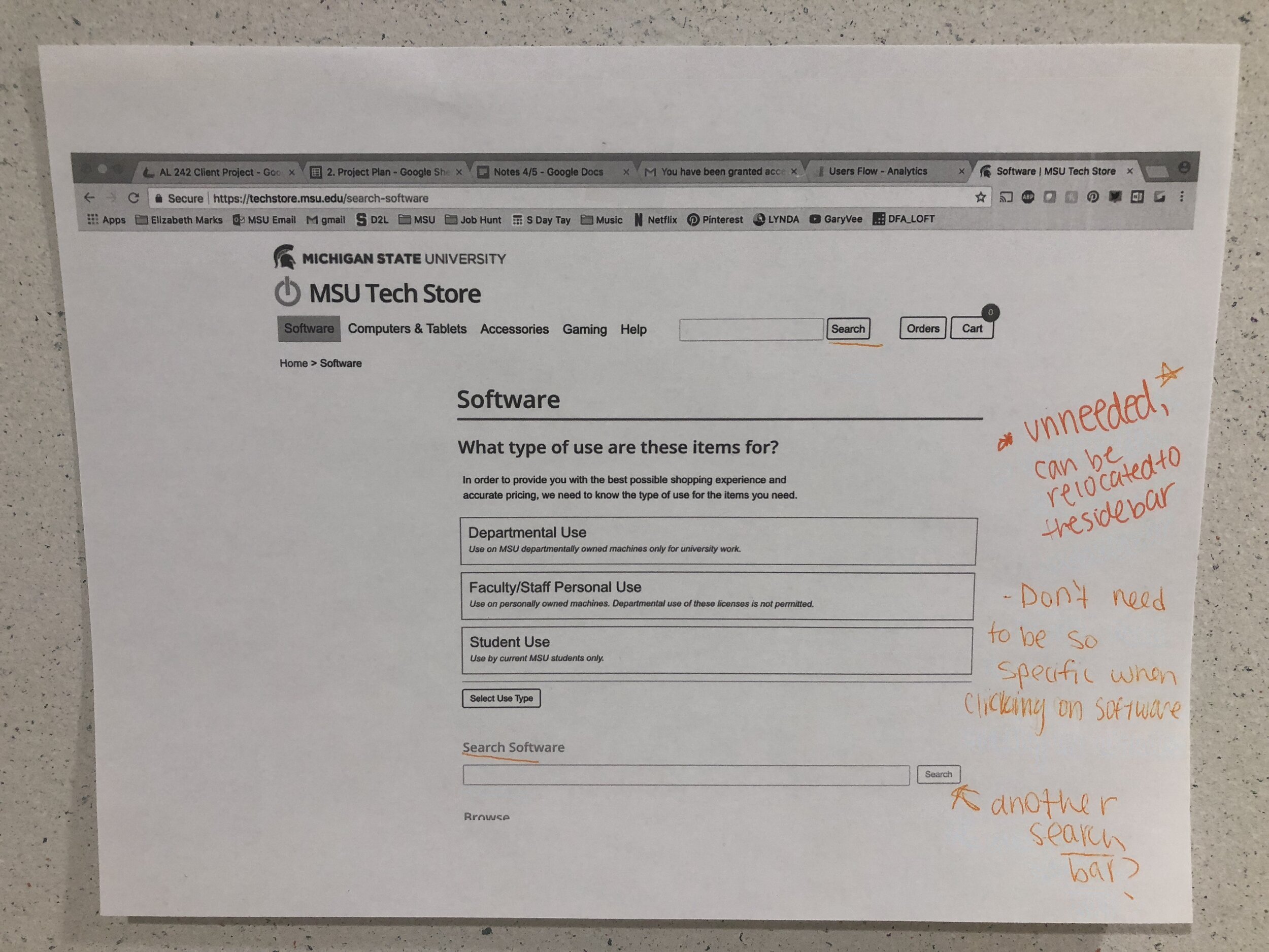
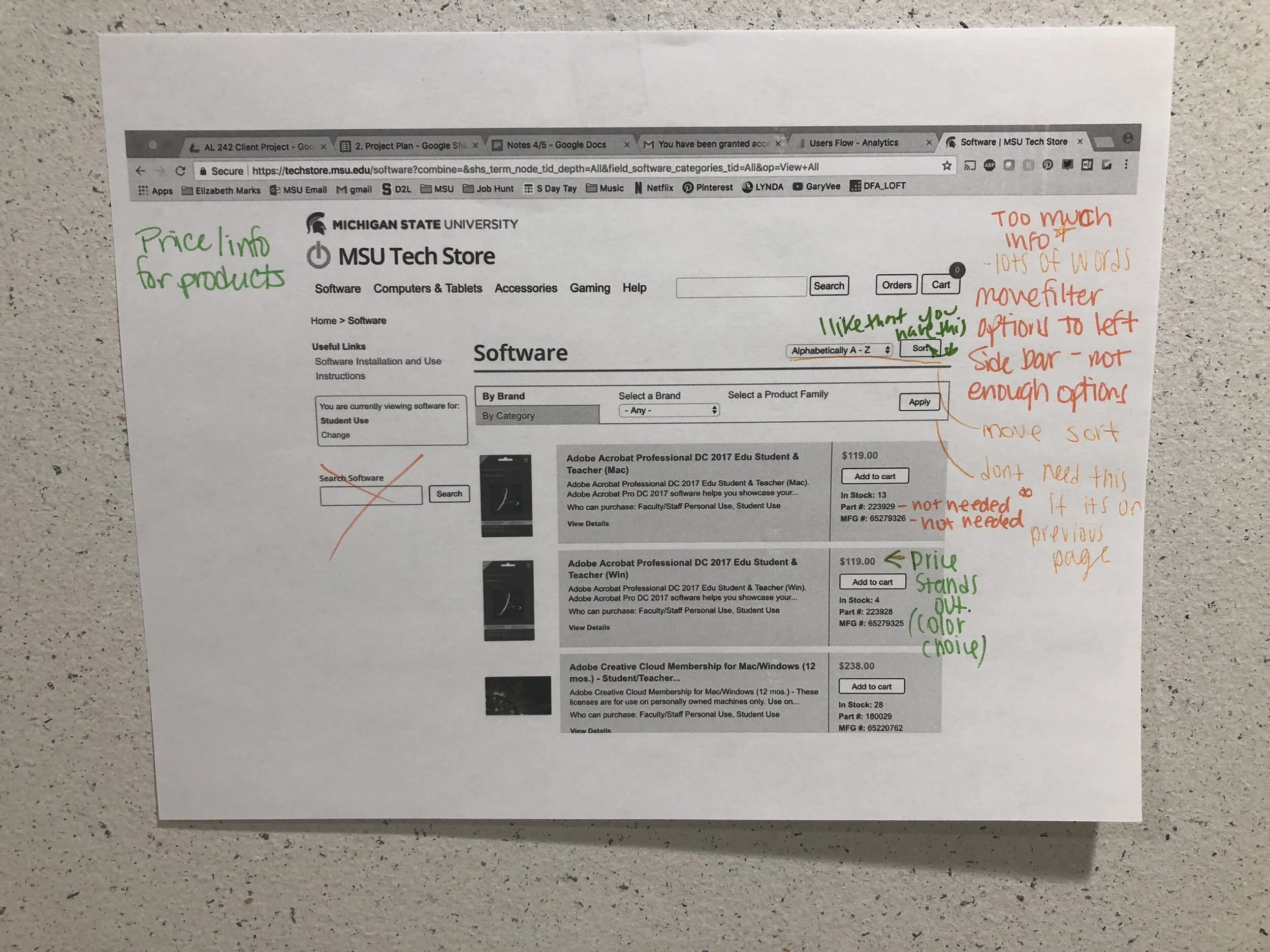
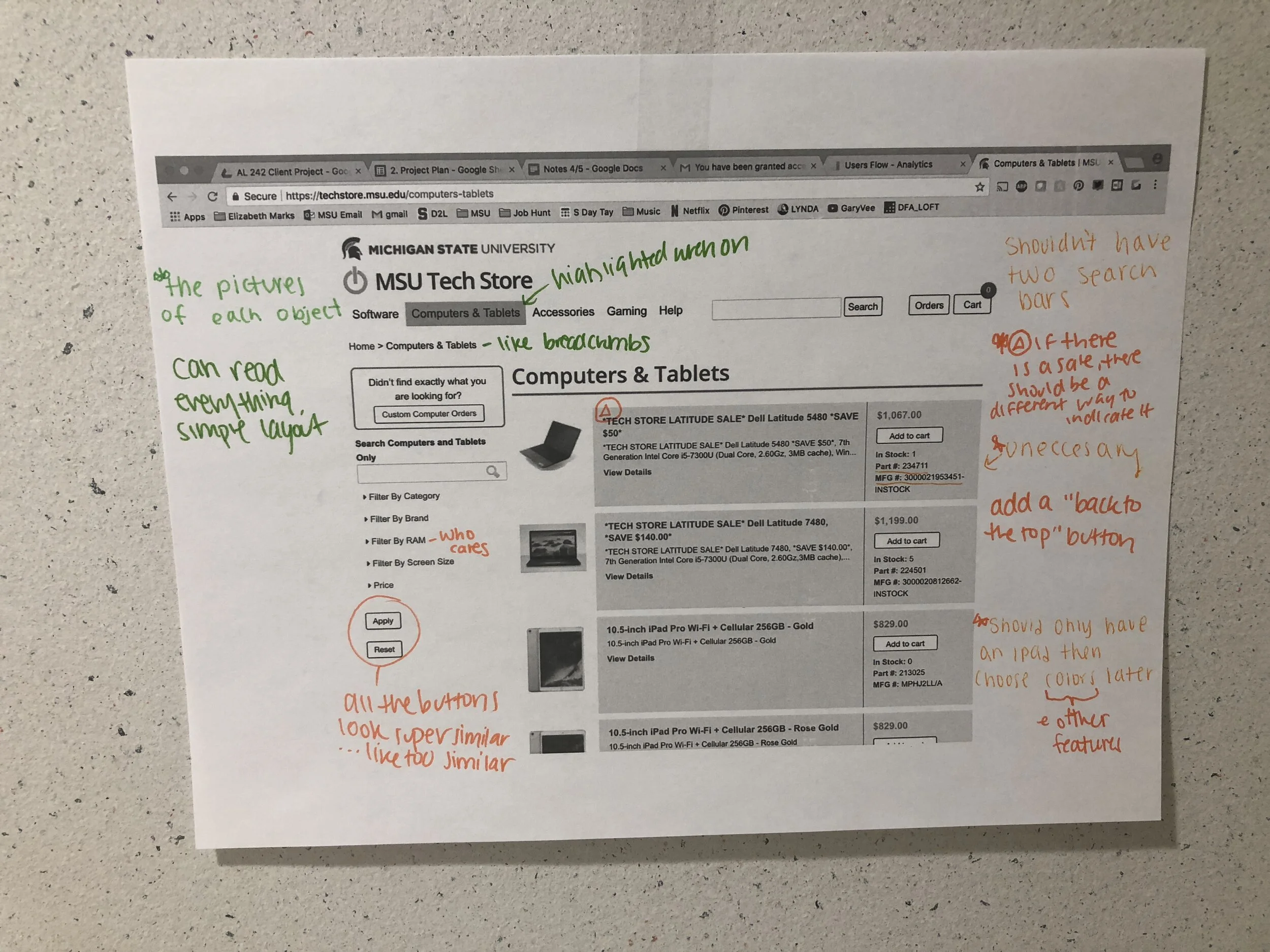
Heuristic Evaluation
Using the knowledge from what our users liked and disliked from the website and the known drop off areas to conduct a Heuristic Evaluation of the current site. We printed the following webpages:
Homepage experience
Checkout experience
Product Tabs such as “Computer and Tablets” experience
Our goal was to identify pros and cons of the follow aspects:
Aesthetics
Navigation
Page Organization
Research Findings:
Competitor Analysis


Google Analytics
Biggest Drop off Areas:
Checkout
Product Tabs such as “Computer and Tablets”
Home page
Heuristic Evaluation Markups


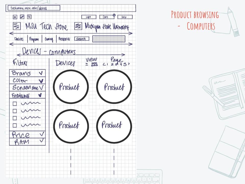
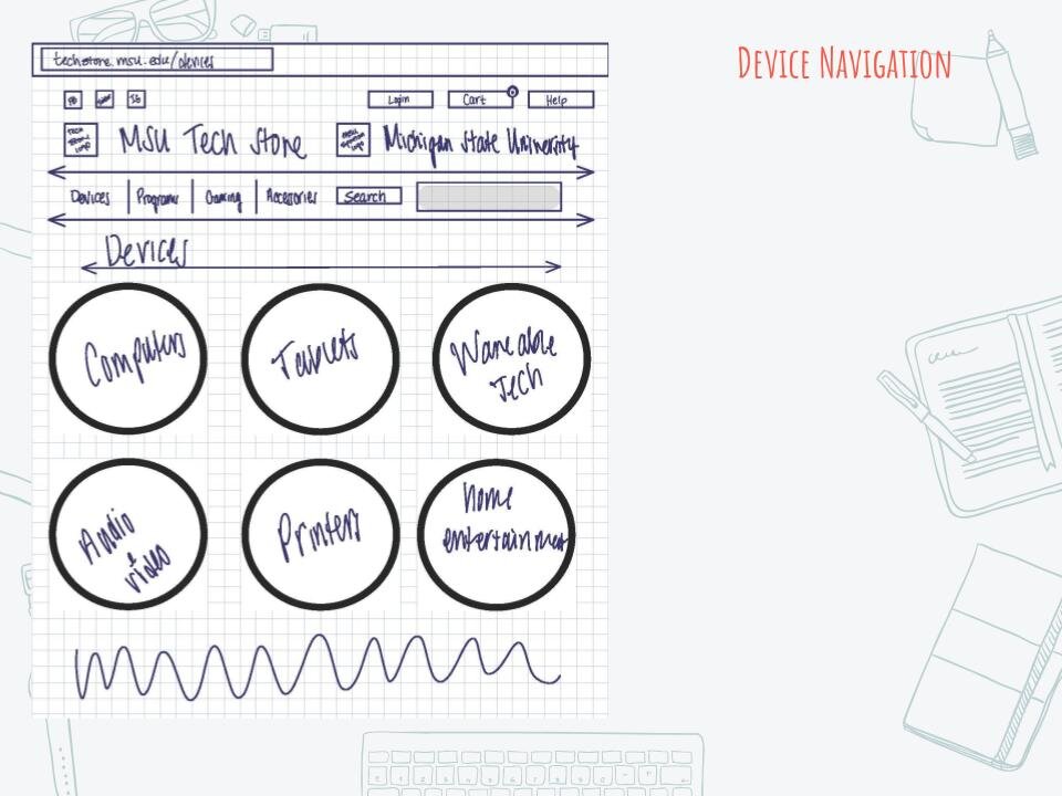
Output: Design Recommendations
Revise the checkout process to make it quicker, easier to use, more visually appealing, and less redundant
Revise homepage
Links to different shopping categories
Update color scheme to include repetition
Remake quotes so they do not take up as much space, are more relevant, include source info
Use spartan shield in design
Links to other social medias and change current location
Twitter
Instagram
Facebook
Redo “Play, Shop, Help”
Add clickable links
More relevant content
Update styling
Reorganize header
Overall Goal
More visual appeal with updated styling
More relevant and and concise content
Make it quicker and easier for users to find what they are looking for on the site

Research: Survey
To understand how to integrate the Spartan community to increase traffic
Survey
We sent this survey out to 40 currently enrolled Michigan State University students. The MSU Tech Store wanted us to ask their users what they believed was the “Spartan Experience.” We did this by using a survey of various questions about their MSU Experience and what was important to them.

Research Findings:
A theme we saw here was “people and community.” We used the “Spartan Community” as our main motivator for our recommendation.

Output: Partnership with the Michigan State University Federal Credit Union (MSUFCU)

Most everyone in the “Spartan Community” knows about the Michigan State University Federal Credit Union. It is advertised at sports games, on billboards, and on a lot of apparel. We thought partnering with the MSUFCU was smart because the MSU Tech store could:
Join their promos at sports games
Promote their store at MSUFCU around campus
Offer possible reward system, example: For x amount of time (beginning of the school year), if you sign up with MSUFCU you get % off a computer
The MSUFCU values “people helping people” and they have a strong presence in the Spartan Community. This resonated with us because the top answers for “Why MSU” was the people and the community.
The MSUFCU is actively involved through different organizations on campus, for example the Lansing State Journal, the MSU Hatch and Michigan State Athletics. This partnership will open many opportunities for the MSU Tech Store to become a household name in the Spartan Community.

Research: Accessibility Check
To ensure usability for all users and better online experience
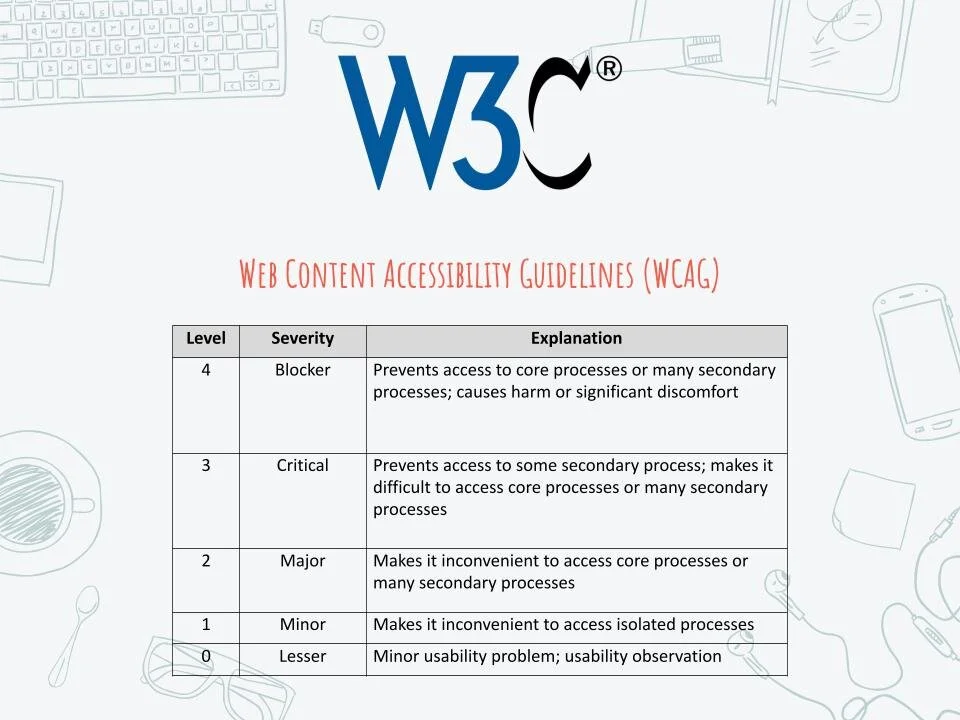
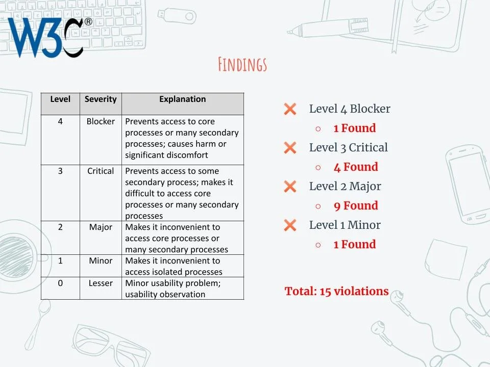
Per their website, Web Content Accessibility Guidelines (WCAG) 2.0 covers a wide range of recommendations for making Web content more accessible. Following these guidelines will make content accessible to a wider range of people with disabilities.
The chart above describes the levels of the violation, the 5 levels indicate the severity of the violation and how it affects a persons with disabilities.
The Web Content Accessibility Guidelines or WCAG are a great start when re-doing a website. Going through what violations current standard will improve the usability for all users.
Research Findings:
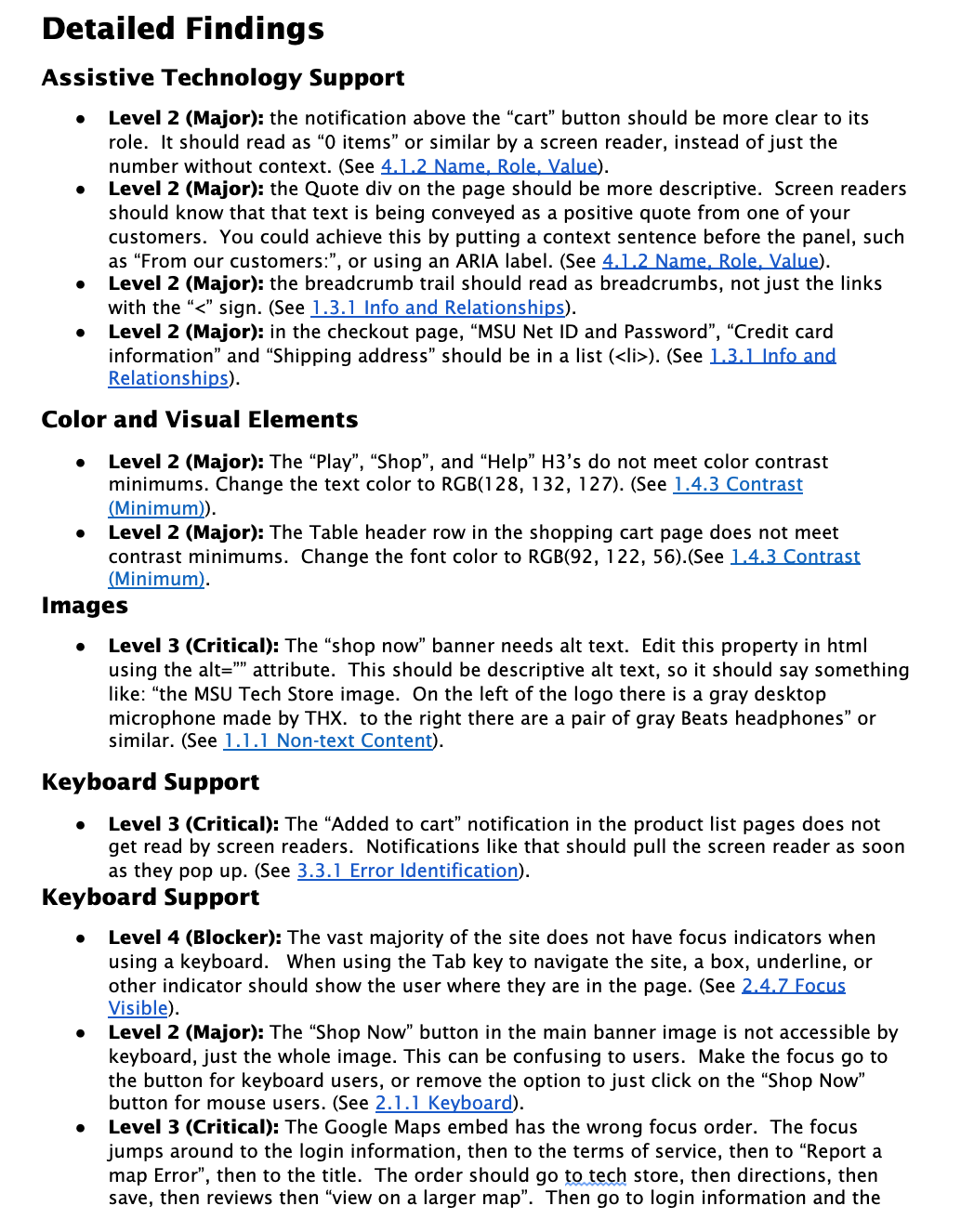

Output: List of Violations and Resources
We evaluated the landing page and the checkout process as that is where the most traffic occurred. From those pages there were 15 violations found. We gave more information about these violations to the MSU Tech Store directly so that they could have resources for improvement. To improve the accessibility of the MSU Tech Store website for individuals with disabilities, these initial findings should be considered but to really make a difference on the site, we believe a further review and remediation should be conducted.
Going Further…
Check in with stakeholders throughout process
Allocate more time for prototype testing
Practice best interview practices to ensure unbias results